Friday, 1 December 2017
Study Task 4 - SWOT analysis
Strengths:
Simplifying images
Use of colour
Positive - social
Time management
Always try and create work that hasn't been done before
Weaknesses:
Digital Art
I don't take criticism very well
I get distracted easily
Focus more on initial Sketching/designing
Opportunities:
Studying abroad for a semester
Competitions
Designing a logo for a business
External opportunities
Using myself more in my art (USP)
Threats:
My distractions can affect my work and motivation
Criticism can put me down and affect my mood
Not producing more design work, not getting the best out of my creativity
Saturday, 25 November 2017
Study Task 3 - My Current Practice
The various briefs and task I have achieved this year have allowed me to develop into a slightly more refined practitioner. Much of my work focusses around the concept of colour and simplicity - My graphic approach to briefs has allowed me find success in Editorial illustration and Character and Narrative.
Because my approach to illustration comes across quite 'graphic' and in your face' I feel like my practice would fit in nicely with Book design, and Packaging - my interest in more symbolic, metaphorical imagery leads me to think Editorial illustration is also appropriate for my practice.
I like telling a story through imagery - simplifying more complex images (using cut out shapes) is a big part of my practice, which would fit nicely into Children Books illustration.
Thursday, 19 October 2017
Study Task 2

'Loving Vincent'
Private Sector
Tertiary Sector
World's first oil painting film, documenting Vincent Van Gogh's life.
Approved by many art galleries around Europe - paintings can now be sold individually

Robert F Hunter
Private Sector
'Jungle Book' Publication
Secondary Sector - analogue production
Whole new perspective - niche market - not much profit made
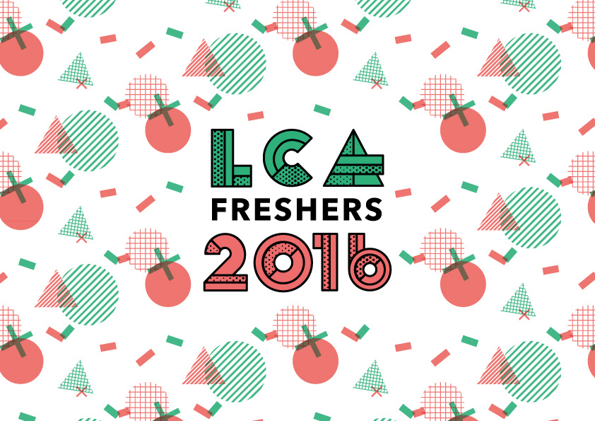
Leeds College of Art Freshers logo
Public sector
Quaternary Sector - Promotion/education
Advertising and promoting the university - representing the university

Facebook app
Private Sector
Tertiary Sector
Social Media - billions and billions of money made - simple logo

Breast Cancer campaign
Tertiary Sector
Tertiary Sector
Campaign helping to raise money by placing pink lids in collection pot
Colour pop - very graphic and vibrant - catches people's attention.
Friday, 6 October 2017
Study Task 1 - Who am i?
I have learnt that I am more of an analogue illustrator than a digital one. I have learnt that it is perfectly fine to make bad drawings - this has allowed me to have more confidence in my work.
I want to know more about selling my work and setting up my own website. I want to become a pro at screen printing. Digital art is something I've never really experimented with so it would be nice to know more about it.
My strengths are mono printing and generally mixing medias to create interesting outcomes. I tend to really think outside the box with my concepts and not be so literal.
I need to be more reflective with my blogging and do it more regularly. I tend to sketch out a few ideas and stick to one which I feel is best - i need to produce more initial sketching.
Noma Bar is one of my favourite illustrators. Rick Berkelman and Shepard Fairey - I'm really drawn to colour and simple shapes.
I need to look at more resources that demonstrate my area of interest within the creative industries - Other than Instagram etc.
 Noma Bar

Mono printing

Screen printing


I wanted to represent myself using materials which reflect my interests as an illustrator. Simplification snd bold use of colour.
Mono printing
Screen printing
Digital art

Self portrait
I wanted to represent myself using materials which reflect my interests as an illustrator. Simplification snd bold use of colour.
Monday, 15 May 2017
Evaluation
I haven't been able to fully engage myself in this project purely because I have prioritised what I thought were more important work (other modules) at the time. Because this was quite a short, but on going module, without many briefings on it, I tended to forget about continuously blogging about things that have informed my practice and inspired me personally aside from the mandatory study tasks.
I enjoyed exploring other artists work, particularly going to exhibitions which is something that gets me really inspired to create work. I enjoyed analysing different variations of artwork and and specifically how illustration is applied to objects. I have learnt a lot about what it takes to become an illustrator - it seems like it is an extremely long process to actually have an established job in the industry. I have learnt that I probably need to put my work out there more to promote my work to the rest of the world, in order for me to become more recognised.
My decision to choose something which was so successful in a few of my previous projects (illustrated self project) worked to my advantage. It allowed me to really engage in the project and become motivated in the development stages - as I was so excited to create such an abstract, outside of the box concept. Because I really pushed myself with this project and decided to do something completely original, I think it was extremely successful and allows people to see illustrating in a completely different light. Looking at Lord Whitney’s work was a huge inspiration for me and my project - costume and character design is something I am very much interested in.
I definitely want to experiment more with the craft of making costumes - the idea of using simple shapes to represent something more complex and contrasted with a figure or something which isn't necessarily hand made - this idea creates really interesting compositions. Looking back on my year, listening to audio and reading written feedback alongside the general progression of my work is really interesting as I didn’t actually know how much I have transformed as a practitioner. The presentation has really allowed me to establish who I am as an illustrator a little better and made me realise who I want to be and the kind of approach I will take into next year.
Probably the things I would do differently next time is record everything that i feel informs my practice - alternative things which have influenced the way in which I work and talk about general things that interest me. What this does is it allows me to be more engaging and connect with modules - adding a personal touch to what I am talking about.
Sunday, 14 May 2017
Casual inspiration


After walking home from a gig, I stumbled upon these really interesting fashion posters. The bold colour combinations and correspondence between the face paint and background, relates really well with what I have been doing with my PPP and throughout the year. The clash of colour works so well and the use of objects to create an interesting stage production is so successful. I like how the characters interact with the objects creating fairly abstract compositions.
Final outcome - alternative interpretations
 This image uses negative space and colour in a truly evocative way. It represents the relationship between art and artist, as though it is one dependent on the chaotic and instinctive use of colour. The way that the figure blends in with the colour could be seen as a statement of the physical bond between art and the person who creates. The shadows create ambiguous and natural shapes which could allude to ideas of the unknown, this could symbolise hidden and unconscious aspects of the creative process. I particularly love the use of geometric shapes and primary and complementary colours which have a shield-like and mechanical appearance, there are also hints of tribalism and expressive identity. Interestingly, I find that the negative space not only possesses character (with the light and dark shadows, and the intersecting lines which start from the left had side) but could also be seen as symbolic of journey development.
This whole idea of 'journey' relates so well to my presentation concept - me being trapped inside my own bubble at the start of the year and being restricted to mundane materials and not opening up my mind to new ways of working and being more expressive with my approach to ideas. The shapes could perhaps represent my old self at the beginning of the year forcing my way out, with my body in the piece of art representing the 'bubble' or 'box'. The overall image represents my creative transition from sticking to what I know best and really challenging myself in being more expressive and seeing things from different perspectives.


Why i did not choose this image?
Although this composition is also extremely effective, especially because it is centre stage and you are able to see everything that I have created - I feel like it is clearly obvious that it is a photograph of someone with objects attached. The objects and person appear as separate things but with the other one the convey a real sense of cohesiveness (character). Compositionally I feel it isn't as interesting as it is simply smack bang in the middle. I also think the eyes open allow the viewer to really engage with the character as after all they are the key to someones soul.
Gif

I created a very simple gif of the character I created. I used hue saturation to alter the colours so they flash from one to another. This is quite successful as the colours represent that sense of movement which shows my progression with the shapes representing my interior and the flashing shows that 'breaking free' aspect. I love colour, shape, dressing up and installations so feel this is a perfect reflection of who I am. If I had more time I wanted to create another GIF but this time showing the progression of me gradually becoming the character from the subtle increase in shapes being added to my body.
Saturday, 13 May 2017
RuPaul Drag Race
I feel like this is something I have always wanted to talk about. Rupaul's Drag Race is a show on Netflix which is similar to Americas next top model, only this time, Americas Drag Superstar. This show has been such a huge inspiration for me both personally and creatively. In terms of it informing my creative practice, it has allowed me to take a whole new direction with illustration. The overall craft and creativity is something I am so drawn to in the show - I feel like some people don't appreciate the art and talent that goes into transforming yourself into a woman. Some of the drag queens make outfits literally from scratch, which is a huge talent in itself. They are able to become and own their alter ego and transform into a completely different character, something which I have achieved in this specific project and my gif one.
It has inspired me to design and make my own outfit, whether that be for my course or in my own time, it is something I definitely want to achieve in my life.
The shoot - building up the character

The painted geometric shapes on my face naturally correspond well with the cardboard cut outs - the appropriate colours selected also adds to this idea. Perhaps there are too many shapes on my face and probably if I were to do it again I would have two or three fairly large shapes which overlap. The white background of my face works really well because it allows the shapes to really stand out.


These images show my development as I built up a non-human character and after careful consideration decided to have a plain red background to correspond well with the opaque use of shape and colour. I experimented with different types of background prior to the red, such as graffiti which I found too colourful and chaotic because it made the character blend into the background. However this did not correspond with my overall intention which was to create a character that stands out and becomes distinct and individual. Which relates to my presentation concept of me becoming free from the constraints of a 'box' and shows my development throughout the course. I also experimented with a dark black background which was not as successful because there was no real connection between the colour and black. Although it allowed my character to stand out, the process made me understand that the overall composition needed more of a balanced harmonic structure.

Black background

Graffiti Background
There is something extremely interesting about both of these images. I like how much the character stands out with the darker background, creating a real sense of obscurity. I don't feel however the black compliments the colours in anyway and doesn't really have a character of itself as there is no real connection to the subject. I also like how the t shirt blends in nicely with the graffiti background as this allows the shapes to really stand out and draw your eyes to that specific part. I do feel however the red is more successful as it has a real sense of balance between blending in and standing out.
Development


I started to stick the shapes onto the t shirt and start to paint my body. I decided to paint each arm a contrasting colour to the leg, adding to the cohesive, complimentary structure of the composition. I wanted to paint my arms a different colour because my aim is to become dehumanised to the best of my ability. There is a real sense of balance created through the colour and shape being well distributed throughout the body. My aim is to completely cover my body in shapes and colour so I am not human anymore and hidden behind the chaos.
The crafting


I started to use the foam board and cut out various shapes and different sizes with a scalpel. I found this process relatively easy and smooth as the material made it easy for me to cut out shapes. I wanted to really broaden the type of shapes I was cutting out so the overall composition becomes a lot more interesting. Because the foam board is smooth and white it was so easy to paint on and gives off a real smooth opaque effect.
Planning and prepping

I started to plan the kind of shapes I will be using for my photography shoot and where I will place them around my body. I don't want it to be top heavy, there needs to be a good balance of distribution around my body. I also started to think about location - where is the best place to take the photo without losing interest in the craft and aesthetic of the costume. I thought about perhaps adding texture alongside the opaque colours to give it some extra edge. I don't however want to over complicate the design.
After my feedback session with Jamie, he suggested that I should really 'go big' and exaggerate the shapes coming out of my body. He suggested instead of cardboard I should use foam board so it is easier to paint, and to get crisper shapes. I need to think about how they will stick to my body and if I am going to wear a t shirt in which case I could use a glue gun - an alternative is to paint my naked body with shapes and colour and somehow attach the shapes with string?
I think probably the most successful idea is if I wear a t shirt and perhaps paint it and stick the shapes on top - this will probably be the most easy and manageable and probably most effective. From this I could add shapes that will come outwards, stuck to the t shirt either using tape of glue gun.
Mono printing


I wanted to experiment with overlapping shapes coming out of my body with the silhouette representing me. I quite like this as a process but i don't think there is a clear unity present if you compare it to my other simple intricate bold shape pieces of art. I don't think the fact there is no real sense of contrast present between me and the shapes with no real depth. The silhouette isn't as successful as I had pictured. I think the repetition of shapes is quite interesting and works well as a representation of my insides escaping.
Analogue experimenting


I have used some cut out pieces of card and paint to emphasise my interior feelings coming out on the exterior. There is a real sense of vulnerability present with the feeling of being insecure through the use of shapes covering up my body. The naked body also adds to the vulnerability effect - My eyes being closed allows the objects to take centre stage becoming the focal point and allowing the portrait to become hidden and appear less important, which is kind of my intentions as I want my outcome to have symbols which reflect me but not necessarily a portrait of myself. The black and white contrasted with bold colours also adds to this effect. I like the large random shapes coming out and covering parts of my body, allowing me to become a character. For my final photography I want to really emphasise the size of the shapes and the contrast of colours.
Friday, 12 May 2017
Chrissie MacDonald


Chrissie Macdonald, a London based illustrator and art director. She does a lot of collaborative projects working with both illustrators, animators and with art installations. I am particularly drawn to her analogue approach to making art. She collects everything from train tickets to cinema tickets to exhibition tickets and uses these objects in her artwork. She is inspired by found objects and ephemera and when she is struggling for inspiration will go to her collection box. A lot of my work is shape driven and I am so fascinated by objects and how they relate with humans - something which I am trying to reflect in this specific project, the idea of objects connecting to a human forms and becoming one. I like how she has used characters to emphasise a fantasy world and story by reducing the size of things and enlarging objects, altering perspective. The colours correspond so well with the characters and instantly become more important because you are drawn to them. With my personal project, I want the objects to become part of me and not necessarily stand out so much as the whole concept behind it is the shapes are a part of my interior personality.
Lord Whitney


Lord Whitney, a duo of art directors, set designers, who advocate play, curiosity and the make believe. What I really love about them and their work is that their main focus is craft, design and aesthetic. I feel like a lot of my work can relate to this concept and reflects that. Particularly with this project I am focusing heavily on aesthetic and craft - making something physically and creating a story or character. The also focus a lot on colour and experimenting with clashing contrasting colours and 'playing' which is exactly my intentions with this project. Their attention to detail is something I am really drawn to and really inspires me - they have clearly meticulously created these pieces of art and their professionalism really stands out. The contrast between really simple mundane, easy accessible objects like paper, card etc made into simplified versions of more complex images and the portrait figure of a human is something which I am so interested in. I'm so intrigued by stage design and how something so simple can come across as something so paramount within the concept of whats being portrayed.

'Mock n Roll'
In this project they teamed up with illustrator Jack Hudson and created a series of mock up albums inspired by quirky 1980s covers. The project was informed by creativity, play and people - this links really well with my current illustrated self project, using humans as a focal point but staged in a way that makes them less human by costume and part of the set but also edited in such away that is so far from reality and creates a whole new world - also something I aim to try and achieve. The daring choice of colours add to the whole fantasy giving off a sense of surrealism - an art movement I would quite like to look further into.
A Capella

I have only recently been so fascinated by a capella (mainly because my boyfriend is musical director of the Uni of Leeds group 'The Songsmiths) There is something so amazing and authentic about seeing it live - the atmosphere is quite incredible. Hearing both voices and body percussion combined with choreography, creates something so special and captivating, you never want to take your eyes off them - the cohesive colour combination of outfits also adds well to this effect. I created a watercolour painting of the members to commemorate their success with international competitions, and although they were extremely unfortunate not to come away with any major awards, they did themselves proud by producing outstanding arrangements of songs which left me feeling completely blown away.
This has inspired me to join a society next year and do more things outside of my creative practise which could then inform it even more.
Experimenting

I started to experiment with composition and how I want the shapes to come off my body. I used Photoshop as a technique for adding shapes. I quite like the idea of shapes really coming out of the body (preferably large) to reflect my inner creative bubble. What it also does is draws you away from the subject looking 'human', instead creating a character which is exactly what I want. This is a project about myself, yes, but I don't want to just have myself visible and become an object myself with shapes simply placed on me - I want to transform myself into a character which reflects my interior thoughts feelings and interests. How will I apply the shapes to my body? Will I paint my body or paint a t shirt that I will be wearing. What colours will I use? I have every intention of clashing colours with complimentary colours adding to the overall composition.
Sunday, 7 May 2017
Idea development
Alternative ideas
I have struggled throughout my year to be really ambitious with my concepts and a lot of the time I have stuck to what I know. I have had many crits with the main feedback being 'push myself' and be more courageous with the experiments. Because of this I was thinking of creating a typology based poster which has myself illustrated inside a bubble trying to burst it until eventually I succeed and set free (representing where I am right now). This shoes my constant struggle to push myself out of my comfort zone until suddenly I manage to do it.
Another idea I had was me being trapped inside my body with a silhouette of my body being covered in bars to represent the 'trapped' idea. The only problem with this one is that I have kind of done something similar with my Maya Angelou project.


This is my idea of dressing up in one different shades of one colour, surrounded by the same colour objects. I feel like as an aesthetic this would look really captivating, camouflaging myself. I have always been a fan of drama and wanted to put myself forward for productions and stuff at school but never felt like i had the confidence - this is kind of a representation of that with me being in the centre of stage for everyone to see but it's not actually me, more of a character covering myself up. I feel like yellow is such a powerful colour and creates a real bold statement. Perhaps one colour may be a bit too simple but I feel like it would be such an interesting composition if done well. I need a pure yellow background for it to be successful. Another idea I had was instead of one colour - everything I wear could be a different colour with my body painted another colour. This reflects my inner ambitions of projecting colour and not taking myself too serious. It also reflects my minimalist, Pop Art and cubism interest - the idea of having so many different dimensions of my personality, each geometric shape or bit of colour representing that idea.
Inspiration


Here are just a few images from pinterest which relate to the theme and concept i'm going for. I really like the idea of having shapes look as though they are coming out of my body. Combination of painted shapes on my body and cut out shapes so it's like a collage. I want to cover as many human features as possible as I want my interior emotions to take over my exterior visuals. It could be interesting to introduce texture alongside contrasting colours. What also could be very interesting is wearing a different colour item of clothing so it adds to that real chaotic colour clash. Another idea I have is painting my whole body in my favourite colour (yellow) and surround myself with yellow objects or paint objects yellow. This was inspired by my Visual language brief of becoming a mutant and blending into the background - I think as an aesthetic it would look really pleasing. For my final outcome I really want to play around with the idea of colour wither that being an illusion or a combination of shape and colour with me as the subject point, I'm not sure yet. I definitely want to include myself in the poster somehow. I need to start doing some roughs and experiments.
Subscribe to:
Comments (Atom)